In today's tutorial, we'll explore how to simplify your code and avoid repeating your markup with Astrojs and Tailwind CSS. This will help you write cleaner, more maintainable code and save time in the long run.
Creating the array
- The id': This is a unique identifier for each section. It will be used to generate unique IDs for each element in our markup.
- The tagline': This is a short description that will be displayed at the top of each section.
- The title': This is the main heading for each section.
- The description': This is a longer description that will be displayed below the title.
- The features': This is an array of objects, each containing an icon and a description. These will be displayed as a list of features for each section.
- The image': This is the URL of an image that will be displayed in each section.
Let's start creating the array and define our data. The array will look like this, because in this case we have two sections, but you can add as many as you want and they will be displayed in the same way and creating a zigzag effect on the page.
More on this later, it's a cool effect. Now, the array:
const sections = [
  {
    id: 1,
    tagline: "...",
    title: "...",
    description:
      "...",
    features: [
      { icon: "iconOne", description: "..." },
      { icon: "iconTwo", description: "..." },
      { icon: "iconThree", description: "..." },
      { icon: "iconFour", description: "..." },
    ],
    image:
      "...",
  },
  {
    id: 2,
    tagline: "...",
    title: "...",
    description:
      "...",
    features: [
      { icon: "iconFive", description: "..." },
      { icon: "iconSix", description: "..." },
      { icon: "iconSeven", description: "..." },
      { icon: "iconEight", description: "..." },
    ],
    image:
      "...",
  },
];
As you can see in the code snippet above, we have an array of objects, each representing a section of our page. Each object contains a tagline, title, description, features, an icons used on our markup and an image. This data will be used to generate the markup for each section of our page.
Creating the markup
Lets create the markup for our sections. We'll use Astrojs to generate the markup for each section based on the data in our array. This will allow us to avoid repeating the same markup for each section and make our code more maintainable, as we can easily add or remove sections by updating the data in our array.
Here's the code:
{
  sections.map((section, index) => (
    <div
      class={`... other general classes ${index % 2 !== 0 ? "md:flex-row-reverse" : ""}`}>
      <div>
        <span class="...">
          {section.tagline}
        </span>
        <p class="...">
          {section.title}
        </p>
        <p class="...">
          {section.description}
        </p>
        <div class="...">
          {section.features.map((feature) => (
            <div class="...">
              {feature.icon === "iconOne" && (
                <svg>
                SVG code here
                </svg>
              )}
              {feature.icon === "iconTwo" && (
                <svg>
                  SVG code here
                </svg>
              )}
              {feature.icon === "iconThree" && (
                <svg>
                 SVG code here
                </svg>
              )}
              {feature.icon === "iconFour" && (
                <svg>
                  SVG code here
                </svg>
              )}
              {feature.icon === "iconFive" && (
                <svg>
                  SVG code here
                </svg>
              )}
              {feature.icon === "iconSix" && (
                <svg>
                  SVG code here
                </svg>
              )}
              {feature.icon === "iconSeven" && (
                <svg>
                    SVG code here
                </svg>
              )}
              {feature.icon === "iconEight" && (
                <svg>
                    SVG code here
                </svg>
              )}
              <span class="...">
                {feature.description}
              </span>
            </div>
          ))}
        </div>
      </div>
      <div class={`h-full ${index % 2 === 0 ? "md:order-first" : ""}`}>
        <img
          src={section.image}
          alt="#_"
          class=" ..."
        />
      </div>
    </div>
  ))
}
Making it dynamic
We are creating a grid with two columns on desktop and reversing the order of the columns for every other section. This creates a zigzag effect on the page, which is a nice touch.
class={`... ${index % 2 !== 0 ? "md:flex-row-reverse" : ""}`}
Adding the tagline
We are displaying the tagline at the top of each section. This provides a short description of the section's content.
<span class="...">
  {section.tagline}
</span>
Adding the title
We are displaying the title of each section as a large heading.
<p
  class="...">
  {section.title}
</p>
Adding the description and the icon
We are displaying the description of each section with and icon for each feature. We are using conditional rendering to display the correct icon based on the feature's icon property stated in the array we wrote earlier. Cool, right? It's a widespread technique used in various programming languages and frameworks to render UI components or elements based on certain conditions or states.
{
  feature.icon === "iconEight" && (
    <svg>
      SVG code here
    </svg>
  )
}
<p class="text-sm mt-4 text-gray-700 text-balance">
  {section.description}
</p>
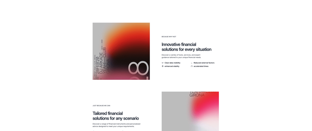
Adding the image
We are displaying the image for each section. We are using conditional rendering to reverse the order of the image and text for every other section. This creates a zigzag effect on the page, which is a nice touch. We are also using the md:order-first utility class to change the order of the image position on desktop screens.
<div class={`h-full ${index % 2 === 0 ? "md:order-first" : ""}`}>
  <img
  ...
  />
</div>
Hope you like it and find it useful.


Top comments (2)
I'll copy some of this, Thank you, Mike.
Welcome Miguel!!