
I'm continuing the theme of personalizing accessibility, which I've started with my two posts. You can find them from the following links:
As a quick recap, in the previous posts, I've discussed how personalization can generally be the key to improving accessibility, and given a concrete example of adding a setting to hide or display labels with icons.
In this blog post, I will continue with concrete examples. We will add a setting to change the app's theme. The user will have four options: follow system settings (the default), light, dark, and high-contrast color theme. Let's dive in.
Why?
Sometimes, users want to use their apps with a different theme than what their phone has as its theme. Personally, I use everything in dark mode, but I've encountered some apps with dark themes with colors that are unusable for me. They either have too much contrast, or sometimes, too little. In those cases, I wanted to change to a light theme. Usually, there has been no such option, so I've either abandoned the app or used it as little as possible if I needed to use it.
So it's all about giving users the control. The minimum options for this type of setting would be the system default, light, and dark. But what about the high-contrast theme? Why would you want to add that? Who even needs it?
High-Contrast Theme
A high-contrast theme has a limited color palette with higher contrast colors. One concrete example is Windows High-Contrast Mode, which was developed for Windows 7 and later. Android provides a setting for high-contrast text, but it only applies to text, not graphics.
WebAIM surveyed low-vision users in 2018, showing that 51.4% of the respondents (n=248) used a high-contrast mode. Low-vision users are a large group needing high-contrast themes, but there are others as well. For example, people with migraines, Irlene syndrome, or some people with dyslexia might benefit from high-contrast themes. High-contrast modes can be useful in direct sunlight for anyone, too.
How?
The flow for adding a possibility to change the app's theme is similar to the labels and icons in the previous blog post: We add a setting to the settings screen, store the value in a data store, and then use that value in the app to decide which theme to display.
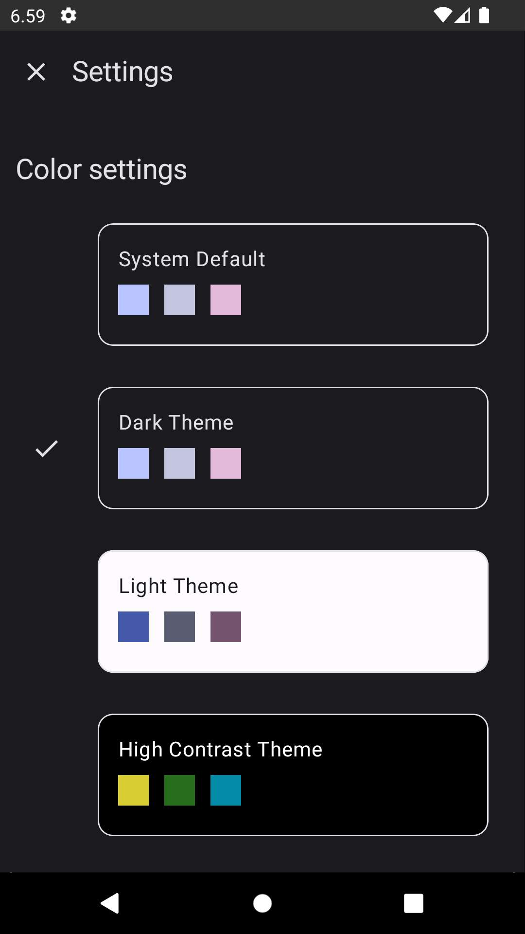
Let's start with the settings screen. We want to add a section for selecting the theme and options to choose from. The list contains four options: System default, dark theme, light theme, and high-contrast theme. In the example, the colors are shown:
Storing the Data
First, continuing with the setup we had in the previous blog post, we want to add a key-value pair to the data store we were using for storing the settings. As mentioned in the previous blog post, for the sake of straightforwardness for the blog posts, the data store is defined and interacted with in the SettingsRepository.
As we have four options to choose from, a simple boolean value does not work in this case. In the code, we want to use predefined values for themes, so we create an enum class for the theme with all the options and use null for the system default.
// ThemeExt.kt

enum class Theme {
    Dark,
    Light,
    HighContrast;
}
The data store can't store enum values, so we need to have a way to convert the enums to strings and back. The to string-part is easy - we can just use the toString()-function. For the other conversion, we need to define a helper function. Let's add it to the enum class:
enum class Theme {
    ...

    companion object {
        fun from(value: String?): Theme? {
            return when (value) {
                Dark.name -> Dark
                Light.name -> Light
                HighContrast.name -> HighContrast
                else -> null
            }
        }
    }
}
In this method, we check which of the theme's names matches the value we're passing in. Also, we have the default case of null - if nothing matches, we assume it's the system default and set the value to null.
Okay, now we have everything to store the theme in the data store. First, let's add a flow to read the value:
// SettingsRepository.kt

private object PreferencesKeys {
    ...
    val colorTheme = stringPreferencesKey("color_theme")
}

val colorThemeFlow: Flow<Theme?> = dataStore.data
    .map {
        Theme.from(it[PreferencesKeys.colorTheme])
    }
So, we first add a preferences key to the preferences key object. For the flow, we read the value from the data store, and then use Theme.from(), which we defined earlier, to parse the string to Theme-enum.
For editing the value, we define a function:
// SettingsRepository.kt

suspend fun setColorScheme(theme: Theme?) {
    dataStore.edit { preferences ->
        preferences[PreferencesKeys.colorTheme] = theme.toString()
    }
}
In the function, we set the string value of the enum to the data store using the preference key we defined.
The next thing to do is to update the SettingsViewModel. First, we add a mutable state flow to store the theme's value and use it in the UI:
// SettingsViewModel.kt

private var _colorScheme =
    MutableStateFlow<Theme?>(Theme.Dark)
val colorScheme = _colorScheme.asStateFlow()
Then, we define functions to read the value from the repository and use the repository's setColorScheme function:
// SettingsViewModel.kt

private fun getColorScheme() {
    viewModelScope.launch {
        settingsRepository.colorThemeFlow.collect {
            _colorScheme.value = it
        }
    }
}

fun setColorScheme(theme: Theme?) {
    viewModelScope.launch {
        settingsRepository.setColorScheme(theme)
    }
}
The last thing is to call getColorScheme() in the init block so that we get the initial value when opening the app:
// SettingsViewModel.kt

init {
    ...
    getColorScheme()
}
Settings Screen
As with the last post, I'm not going to demonstrate how to use the values from the SettingsViewModel but I'm just going to mention that from accessibility and semantics point of view, there are a couple of things to note: Each of the color options need to have selectable-modifier, and the component wrapping the color options needs to have a selectableGroup()-modifier. How these look like in my code:
// SettingsScreen.kt

@Composable
fun ColorOption(
    option: ColorOptionData,
    isCurrentTheme: Boolean,
    setColorScheme: (Theme?) -> Unit
) {
    ...

    Row(
        modifier = Modifier.selectable(
        selected = isCurrentTheme,
        role = Role.RadioButton
    ) {
        setColorScheme(option.theme)
    },
        ...
    ) {
        ...
    }
}
In the parent component, we have the following:
// SettingsScreen.kt

Column(
    modifier = Modifier.selectableGroup(),
) {
    colorOptions.map { option ->
        ...
    }
}
If you want to know more about why this is done, my blog post Improving Android Accessibility with Modifiers in Jetpack Compose explains the reasons.
Changing the Theme for UI
The final step is to use the stored value for the theme and update it accordingly. We'll need to add logic to set the theme according to the stored value.
Note that the actual theme definition is out of scope for this blog post - I have colors defined for dark, light, and high-contrast themes, and I'm going to use them in the code.
In Theme.kt, let's add additional checks to the default implementation of the application theme:
// Theme.kt

@Composable
fun AppTheme(
    useDarkTheme: Boolean = isSystemInDarkTheme(),
    theme: Theme? = null,
    content: @Composable () -> Unit,
) {
    val colors = when (theme) {
        Theme.Dark -> DarkColors
        Theme.Light -> LightColors
        Theme.HighContrast -> HighContrast
        null -> if (!useDarkTheme) {
            LightColors
        } else {
            DarkColors
        }
    }
    MaterialTheme(
        colorScheme = colors,
        content = content,
    )
}
We add an optional parameter of type Theme to the AppTheme composable and then use it to decide which colors we're setting to the MaterialTheme component. If the theme is not null, then we set the colors per the value, and if it's null, then we should use the system's default colors. For this, we check the isSystemInDarkTheme value and set the colors accordingly.
Finally, in MainActivity, where our app's root is defined, we read the value of the stored theme and then pass it to the AppTheme-composable:
// MainActivity.kt

val theme = settingsViewModel.colorScheme.collectAsState()

AppTheme(theme = theme.value) { ... }
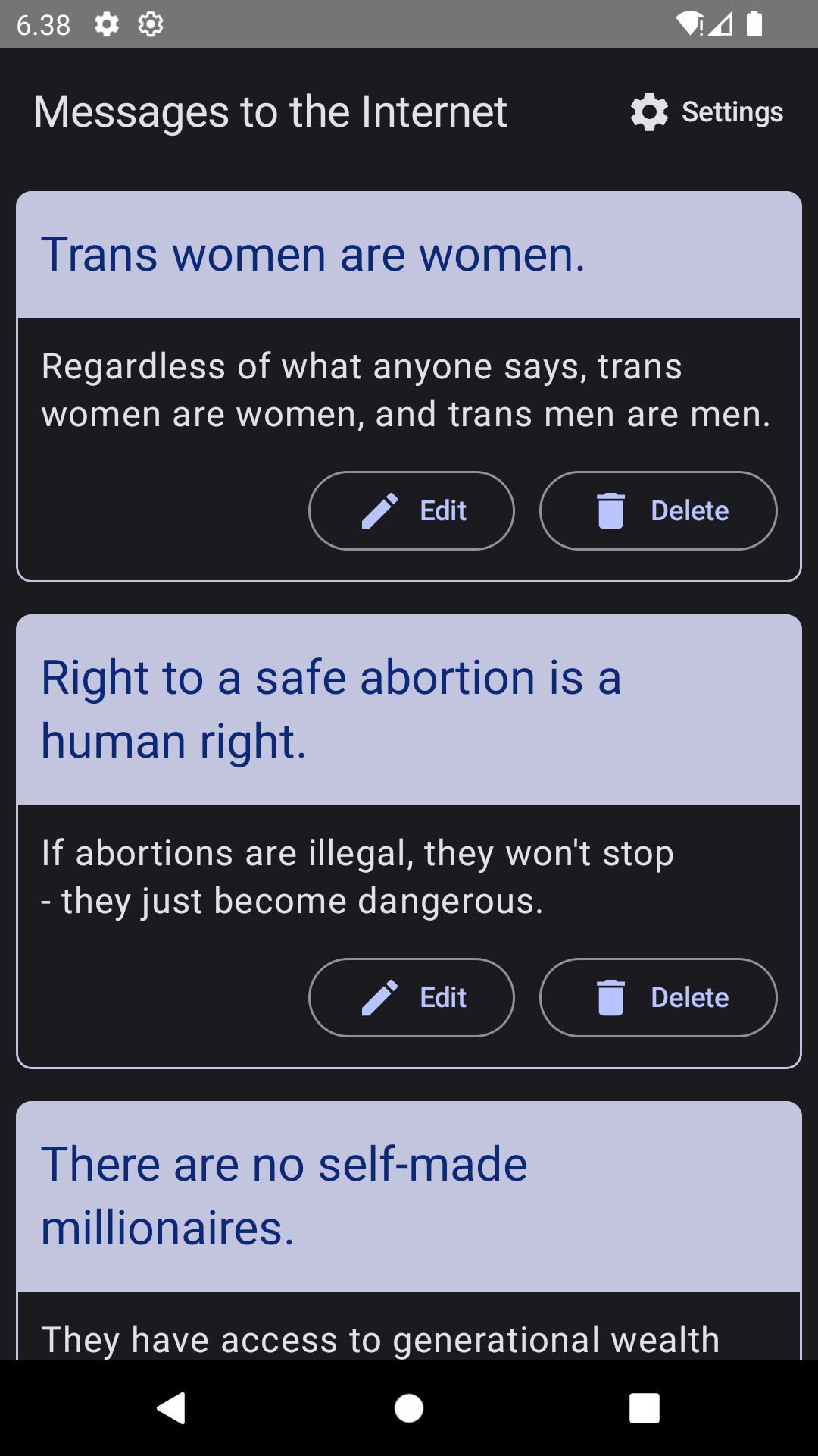
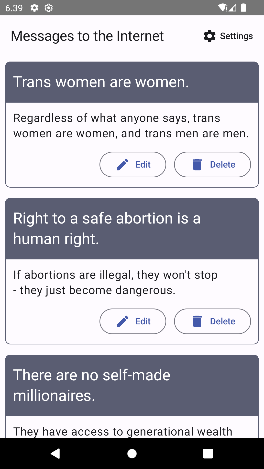
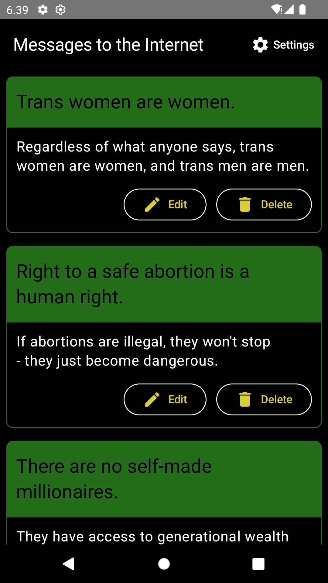
And with these changes, we will get the following themes visible when they're selected from the settings:
Wrapping Up
In this blog post, we've looked at how to let users decide which theme they want to use in the app by adding a setting for it. The provided themes are either light, dark, or high-contrast themes - or follow the system default theme.
Have you implemented a theme selector in your app? Have you encountered the high-contrast theme before? Do you have ideas for which type of accessibility settings I could cover next?

Top comments (0)